Showing posts with label TIP AND TRICK. Show all posts

Friday, November 5, 2010

Basic Techniques of Hypnosis

Definition: Hypnosis is one branch of magic that used to play with the human subconscious. Once a person enters his subconscious, we can embed certain suggestions in their minds, and make them do things that we ordered.

kejahatan-hipnotis

You Should  Know:

  • Hypnosis (especially "extreme Hypnotist" as is often done by Romi Rafael) will only be successful if the object (volunteers) willing to be hypnotized.
  • Nature of the human mind is divided into two, namely conscious mind  and the subconscious (unconscious mind). The purpose of hypnosis is to make the volunteers are in their subconscious. The situation after the volunteers do various things in the subconscious influence is called "trans".

What you should have to hypnotize others?

1. Self-Confidence

Before doing hypnosis, you have to be really sure and believe that you can hypnotize other people. Convince yourself that you are a great hypnotist. Without self-confidence, hypnosis that you do is doomed to fail.

2. Rhythm


Customize your sound with the rhythm of the volunteer breath speed. This can be done by noticing  the diaphragm motion when the volunteers breathed. When the most appropriate to lead the volunteers into their subconscious mind is when they breathed out (as is often done by Romi Rafael).

Usually, if the hypnotist was success, tempo and rhythm of the breath of the volunteers became slower. At that time, slow your speech tempo and rhythm speed to match  the rhythm of the breath of the volunteers.

3. Voice Tones


There are two kinds of  voice tonethat can be used in hypnosis.

a. Monotonous tone of voice

This method is often used by Romi Rafael. Voice tone is monotonous tone of voice, flat and tend to the same from beginning to end, with the use of words constantly repeated. The purpose of using a monotone voice is to make the conscious mind of the  volunteers is bored, so he is more easily into his subconscious mid.


b. Voice Tone Wavy

His tone is the tone of voice used up and down, weak-strong, low-high. Actors hypnotist will talk first with a low tone, then the more elevated up to bring the volunteers into a state of "trance".


Please select one tone of voice to suit your personality. Choose the most convenient and comfortable when you say it.

4. Bringing the volunteers entered the subconscious


First, tell the volunteers to perform a routine, say "Start count from 1 to 10, each count will make you into your subconscious."

Or "Take a deep breath ... and exhale."

Or ask "What is your name?"

In the midst of that process, shake his hand, face-to-eye, and do something shocking that it quickly entered her subconscious. Something surprising that among other things:

-. Jerk handshake
-. Lifting her wrists to the top
-. Flick your finger to the forehead of volunteers

Remember, when doing these things, still maintain eye contact with the volunteers. After that, ask  the volunteers to do the things that you ordered with hypnotic sentence.

5. Hypnotic Sentences


Hypnotic sentences must be spoken fluently, without words like "uh ..." "um ..", "uh ...", and so forth. The sentence is usually a sentence hypnotic suggestive tone command, short, dense, and uttered repeatedly.


Example of the sentence of hypnosis:

The first thing you should do is ... ...
Make yourself feel good ... ..
Sit in a chair with both hands on the thighs ....
Once you feel comfortable ... ....
Focus your eyes to one point ... ..
well ... ...
Aim your eyes to this point ... ....
Your eyes will be more severe ... ...
The more weight ... ..
And you will fall asleep ... ...
(... ... ..) Indicates that you should give pause before heading into the next sentence.

You are now in a beautiful seaside ...
Very beautiful ....
And will become more beautiful ... ...
You'll see the waves and foam ....
Zephyr ...
The shade of coconut trees ... ..
Feel it all ... ..
Experience with all your senses ... ..
Get in the water ... ..
Feel the chill ....
Use your hands to swim through the ocean ....
etc .... etc ....

To revive the volunteers, you can use the following sentence:

You will see a boat ....
That will take you to leave this beach ...
But you will know ....
All the beautiful memory of this beach will remain in your mind ....
Serenity ....
Shade ...
So ....
Get on the boat ... ....
And you will find a message written on the boat ...
Start counting from 1 to 10 ... ..
And each count aakan bring you leave the subconscious ...
And back to consciousness ....
etc ... etc ...

To be remembered!, tempo, rhythm, tone, and volume during hypnosis should consistently pronounce sentence.


Hypnosis is a branch of magic which is very difficult to master. To master it takes a long time. So, if you practice the things written here but still failed in doing hypnosis, it is simply natural. Keep practicing and practicing, then you will become a master hypnotist.

Mysterious Holes Appear in All part of the World


Mysterious hole appeared in various countries around the world. Large crater-shaped hole sometimes makes the road collapsed.

In January 2007, a giant crater collapsed subway stations in Sao Paulo, Brazil. This crater appears on construction sites in South America's largest city. Minivan passenger falls into it, this crater lip erode the road.

hole in world

Earlier in 2004, a crater appeared at the construction site in Munich. This crater  make a bus goes into it.

While in 2001, a 40-foot deep crater appeared in the garden Michael Whittaker Norwich.

Road collapses occurred in July 2010, where a street in Ahmedabad, India collapsed. This horrific event to make people around rushed to the rescue. Even firefighters using a crane to help lift the bus off the road which had collapsed.

In August 2009, a street in Hefei, Anhui province, China, collapse. This causes a taxi and three motorcycle fell into the hole.

While in May 2009, a zebra cross in Nanjing, Jiangsu province, China, collapse. Fortunately no casualties from this incident.

In June 2010, a hole appeared near the elementary school in Dachegnqiao Qingquan, Ningxiang, Hunan province, China. This hole has a width of 150 meters and a depth of 50 meters and continued to expand since its first appearance in January. So far, this hole has destroyed 20 homes residents.

The biggest hole is The Great Blue Hole. The hole has become a favorite dive at Lighthouse Reef, Belize, the Caribbean. This hole has a diameter of 300 meters and a depth of 125 meters.
At the same time, a hole appeared on the highway Quzhou, Zhejiang province of China.

What happen with this world?

Wednesday, November 3, 2010

6 Secrets about Toothpaste

There are so many toothpaste products on the market that promise you a fresh tooth, whiter, and prevent holes. This causes you as a consumer to be confused to choose the best. Ho much of what the heck, do we need? How much toothpaste should we use? Which one is better between a gel or paste?

Here is a guide.

secret of toothpaste


1. Fluoride, the most important ingredient


Currently, there are so many toothpaste products are enriched with contents according to the needs of our teeth, such as tartar control, whitening, or a breath freshener. However, in toothpaste, the most important content is its fluoride. According to the Academy of General Dentistry, tooth brushing with fluoride toothpaste twice a day can reduce tooth decay by 40 percent.

2. Bleach will not directly make the teeth so white


There are dozens of products that promise a bright smile, but what is the content of the toothpaste with whitener? "Toothpaste with whitener containing light 'whitener'  to help remove stains on teeth surface," says Clifford Whall, PhD, Director of the American Dental Association (ADA) Seal of Acceptance Program.

Particle shapes used in whitening products modified to clean up the stain better so you can see the difference in your teeth. Even so, these products do not contain bleach so it is not possible to make your teeth straightly  white as if you are undergoing treatment in a professional teeth whitening.

3. Fewer, better


In toothpaste commercials maybe you will see the model holding a toothbrush filled with toothpaste. However, toothpaste squeeze in this much (say, 2 cm long) will not make your teeth cleaner than if you only pour 1 cm of toothpaste, according to E Jane Crocker, PHD, President of the Massachusetts Dental Hygienists' Association.

"All you need is a pea-sized toothpaste," she said. Toothpaste as it will not only make more effective tooth brushing (with clean and remove plaque, stains, and food scraps), you will also save your toothpaste.

4. The way you brush your teeth is much more important


You can just buy the best toothpaste and toothbrush most perfect in the store, but if you do not brush your teeth properly, in vain. "To brush your teeth properly, you must hold the brush at a 45 degrees so you create a feather brush your teeth in between the teeth and gums," said Dr. Whall. "Move your toothbrush in a small circle in the area, then continue on another tooth. This process will spend about one or two minutes to complete."

5. The content of toothpaste can be staggering


You may not recognize the names listed on the toothpaste tube. Materials such as seaweed or detergent can be found in many air-fluoride toothpaste. According to the ADA, thickening toothpaste can be made from seaweed colloids, colloidal minerals, and natural gums. As for the foam, most rely on detergent products such as sodium lauryl sulfate, which can also be found in shampoo or liquid soap. This material is considered 100 percent safe and effective by the ADA.

6. Paste or gel?


Some say, pasta is better than a gel, or vice versa. However, according to health experts, both types of material is still clean their teeth properly, really. "Besides the taste, texture, or how it affects the toothpaste wearer feeling, there is no big difference from other forms of material," said Crocker. "I think really, it depends on the choice of each, which is usually known through trial and error. I personally encourage my patients to use any products that could make them brush their teeth." In other words, up to select what product, what matters is  brush your teeth regularly!

Thursday, June 11, 2009

Thursday, May 21, 2009

$Origami (Money Origami), one alternative for your child education

Ever heard about  Origami?. I guess so. Origami (origami) (from oru meaning "folding", and kami meaning "paper") is the traditional Japanese art of paper folding. The goal of this art is to create a representation of an object using geometric folds and crease patterns preferably without the use of gluing or cutting the paper, and using only one piece of paper.

Origami only uses a small number of different folds, but they can be combined in a variety of ways to make intricate designs. The most well known form is probably the Japanese paper crane. In general, these designs begin with a square sheet of paper whose sides may be different colors or prints. Contrary to most popular belief, traditional Japanese origami, which has been practiced since the Edo era (1603–1867), has often been less strict about these conventions, sometimes cutting the paper during the creation of the design.

In origami, there’s no limitation on paper you can use. You can use any kind of paper. But one of the most interesting paper we can use is money. Money has printed face on it. And see what you can do with that.


Tuesday, May 19, 2009

Is Highest Paying CPC Always Appear First?

If there are multiple Google AdSense ad units on a web page, it is generally assumed that the top ad unit (the one which appears first in the HTML source code) will serve the highest paying CPC ads. Well, that may be true most of the times but not always. Let’s understand why.

But before you dive into the example below, please watch this excellent video by Dr Hal Varian, Chief Economist at Google, as he explains how an ad auction works and what factors determine the position of AdSense ads on a web page for a given keyword.

The Google AdWords system assigns a "Quality Score" to every advertiser who is participating in the ad auction and this score is determined by the quality of the advertiser’s website, the historical CTR of his ads on Google and a couple of other factors.

For instance, the Google ad system is likely to assign higher Quality Scores to Sony.com or Amazon.com for the keyword "digital cameras" than an advertiser xyz.com who is trying to promote his eBay auction on the AdSense network.

Google than computes the final rank (or ad position) of each advertiser using their respective quality scores and the maximum amount they are willing to pay for a single click (CPC).

Ad Rank of an advertiser = Quality Score * Maximum CPC Bid

google-cpc-prices

Coming back to our original example, let’s say four advertisers are bidding in an auction to show up on a web page that is about "digital camera".

The advertiser Sony.com has been assigned a score of 8 by Google and they are ready to spend a maximum of $16 per click.  Amazon has an even quality score (9) but they have specified their maximum CPC as $14 and so on.

Now the ad position (column 5) of various advertiser in an AdSense unit is determined on the basis of Ad rank (column 4) but the actual cost (or CPC) that these advertiser have to pay per click to Google is not always in that order.

As Dr Varian explains (time 05:50), the price that an advertiser has to pay (his actual CPC) is equal to the Ad Rank of the advertiser just below him divided by his own CPC bid.

adsense-positions

So in the case of Sony, they’ll have pay 126 (the Ad Rank of Amazon) / 16 (CPC Bid of Sony) and this is equal to 7.88.

The click cost for Amazon will therefore be 120/14 = 8.57 which is more than that of Sony but the Amazon ad will still show up below the Sony ad since the Ad Rank of Sony is higher.

Google will share a fixed portion of ad revenue (or click price) with the AdSense publisher (where these ads are shown) and therefore a click on a Sony ad will fetch him less revenues even though the ad occupies the top slot.

Google Adsense Publisher Tend to Click on Their Own

54% of all Google Adsense publishers admit addiction to click income. A recent online study conducted by a small group of Google Publishers found that 54% of all Adsense publishers where addicted to the income potential of Googles Pay Per Click system.

Some Google Adsense Publishers Need Therapy
It was also found that some publishers were so addicted they where checking their Adsense statistics up to 50 times per day.

Google Adsense is a system where individuals who own content rich website’s can earn money by placing small targeted ads within the content of their website.

The ads can be customised to fit within the scheme of the website and some successful publishers can earn in excess of $200,000 per month.

One publisher stated that her addiction started the day she placed the Adsense code into her html code. “I was introduced to Adsense by my boyfriend, who makes around a $1000 a month”. She went on to say that she doesn’t blame Google for her addiction, but the fever in which forums and blogs promote the fact that anyone can become rich with this scheme inspired her to keep adding pages and checking her stats.

Kate, did state that she was earning a reasonable amount of money from Google Adsense, but told us she also spent a considerable amount of money on scripts, ebooks and promises of gaining all you would ever want to know about Adsense, from forum gurus claiming they had made their fortunes and where willing to share their secrets if you deposited $97 into their PayPal account.

Rags to Riches in 51 Days
Another publisher I spoke to told me his addiction had made him a rich man in 51 days. “I was browsing the net on October the 15th last year and came across a website that had a photo of a guy holding a Google cheque for nearly $200,000 dollars. Under the picture it stated that this was just a 1 month pay check from Google. Lights and bells went off in my head as I thought, Man, this is what I have been looking for”.

David, had been dabbling in online money making schemes for about 6 years and to date had not been very successful. But he did have 3 website’s which had 1000’s of visitors to them and after reading all he could on the subject, David placed 2 small Adsense ads on each page of his 1000 page website. “I didn’t sleep that night. I was so excited, I checked my stats every 10 minutes all night” he said. Just when he was about to give up for the night, David did his final stats check. “It was 5.50am exactly and I nearly fell off

my chair. 1000 impressions, 98 clicks and a total of $18 income. I couldn’t sleep that day as I checked my stats every 15 minutes and watched the income rose to over $58 for the day. I was addicted to this thing, this scheme was going to make me rich and I wasn’t going to miss a minute of it” David said.

David had gone from $32 in his Bank account to over $6,700 in just 51 days. He had checked his stats on average 60 times per day and had spent more than 612 hours during that 51 days optimising his sites and adding content. David also admitted just like Kate that he had spent quite a bit of his profits on “how to” books, but stated that it was money very well spent.

“I am addicted to Google Adsense” Kate told me, ” but what better addiction could you have than earning money, while doing something you love”.

Monday, April 13, 2009

Programs to Make your Own Video Tutorial


Ever wondered how people show you so clearly what is happening on their computer, like in the Photoshop Video Tutorials we shared with you? Thanks to screencasting software, anyone can do it. So what’s stopping you now from making your own how-to videos? Try out one of these 12 tools and get to making your first video!

Free Programs

aviscreen

AviScreen - As the name would imply, this capture program records the video into AVI files, but can also do BMP photos. It’s Windows only and does not record audio.

camstudio

CamStudio.org - An open source program for capturing your on-screen video and audio as AVI files. Windows only, and absolutely free.

copernicus

Copernicus - A free program for Macs that focuses heavily on making quick and speedy films by recording the video to your RAM for quicker access. Does not include any support for audio.

jingproject2

JingProject.com - Beyond recording video, Jing allows you to take a picture of any portion fo your desktop, draw on it, add a message, and immediately upload your media to a free hosting account. You are then given a small URL that you can give to whomever needs to see the image or video. Works with Macs and Windows machines.

screencastomatic

Screencast-O-Matic.com - A Java-based screencasting tool that requires no downloads and will allow you to automatically upload to hosting. According to their site it works well with Macs and Windows machines, but does have some issues with Linux.

wink

Wink - Screencasting software that focuses on making tutorials with audio and text annotation abilities. Outputs to Flash, PDF, HTML, EXE files and more.

Commercial Program

adobecaptivate

Adobe Captivate - While Adobe is almost always synonymous with quality, it also always means it’s going to be expensive. Pricing starts at nearly $700.

allcapture2

AllCapture - Capture in real time, add audio during recording or after completion. Can output to Flash, EXE, ASF, DVD, SVCD and VCD. Free trial available, Windows only.

hypercam

HyperCam - Windows only system for recording screen activity to AVI files along with system audio. Free trial with $39.95 for full version.

ishowu

iShowU - Offers a wide-range of presets that allows you to record directly into Quicktime and up to 1080P in both NTSC and PAL formats. Also does audio and the file is ready to be published as soon as hit stop. Mac only.

screenmimic

ScreenMimic - Software for the Mac that offers transitions, audio dubbing, can output to HTML, Quicktime and Flash. Free download and $64.95 for the paid version.

screenrecord

ScreenRecord - Outputs to Quicktime directly and can record your clicks and all on-screen activities. Offers a free trial and then $19.95 to purchase.

Friday, April 10, 2009

10 Principles of Effective Web Design

In order to use the principles properly we first need to understand how users interact with web-sites, how they think and what are the basic patterns of users’ behavior.

How do users think?

Basically, users’ habits on the Web aren’t that different from customers’ habits in a store. Visitors glance at each new page, scan some of the text, and click on the first link that catches their interest or vaguely resembles the thing they’re looking for. In fact, there are large parts of the page they don’t even look at.

Most users search for something interesting (or useful) and clickable; as soon as some promising candidates are found, users click. If the new page doesn’t meet users’ expectations, the Back button is clicked and the search process is continued.

  • Users appreciate quality and credibility. If a page provides users with high-quality content, they are willing to compromise the content with advertisements and the design of the site. This is the reason why not-that-well-designed web-sites with high-quality content gain a lot of traffic over years. Content is more important than the design which supports it.
  • Users don’t read, they scan. Analyzing a web-page, users search for some fixed points or anchors which would guide them through the content of the page.

     
    Users don’t read, they scan. Notice how “hot” areas abrupt in the middle of sentences. This is typical for the scanning process.

  • Web users are impatient and insist on instant gratification.Very simple principle: If a web-site isn’t able to meet users’ expectations, then designer failed to get his job done properly and the company loses money. The higher is the cognitive load and the less intuitive is the navigation, the more willing are users to leave the web-site and search for alternatives. [JN / DWU]
  • Users don’t make optimal choices. Users don’t search for the quickest way to find the information they’re looking for. Neither do they scan web-page in a linear fashion, going sequentially from one site section to another one. Instead users satisfice; they choose the first reasonable option. As soon as they find a link that seems like it might lead to the goal, there is a very good chance that it will be immediately clicked. Optimizing is hard, and it takes a long time. Satisficing is more efficient.

     
    Both pictures show: sequential reading flow doesn’t work in the Web. Right screenshot on the image at the bottom describes the scan path of a given page.

  • Users follow their intuition. In most cases users muddle through instead of reading the information a designer has provided. According to Steve Krug, the basic reason for that is that users don’t care. “If we find something that works, we stick to it. It doesn’t matter to us if we understand how things work, as long as we can use them. If your audience is going to act like you’re designing billboard, then design great billboards.”
  • Users want to have control. Users want to be able to control their browser and rely on the consistent data presentation throughout the site. E.g. they don’t want new windows popping up unexpectedly and they want to be able to get back with a “Back”-button to the site they’ve been before: therefore it’s a good practice to never open links in new browser windows.
1. Don’t make users think

According to Krug’s first law of usability, the web-page should be obvious and self-explanatory. When you’re creating a site, your job is to get rid of thequestion marks — the decisions users need to make consciously, considering pros, cons and alternatives.

If the navigation and site architecture aren’t intuitive, the number of question marks grows and makes it harder for users to comprehend how the system works and how to get from point A to point B. A clear structure, moderate visual clues and easily recognizable links can help users to find their path to their aim.

beyondis

Let’s take a look at an example. Beyondis.co.uk claims to be “beyond channels, beyond products, beyond distribution”. What does it mean? Since users tend to explore web-sites according to the “F”-pattern, these three statements would be the first elements users will see on the page once it is loaded.

Although the design itself is simple and intuitive, to understand what the page is about the user needs to search for the answer. This is what an unnecessary question mark is. It’s designer’s task to make sure that the number of question marks is close to 0. The visual explanation is placed on the right hand side. Just exchanging both blocks would increase usability.

ee

ExpressionEngine uses the very same structure like Beyondis, but avoids unnecessary question marks. Furthermore, the slogan becomes functional as users are provided with options to try the service and download the free version.

By reducing cognitive load you make it easier for visitors to grasp the idea behind the system. Once you’ve achieved this, you can communicate why the system is useful and how users can benefit from it. People won’t use your web site if they can’t find their way around it.

2. Don’t squander users’ patience

In every project when you are going to offer your visitors some service or tool, try to keep your user requirements minimal. The less action is required from users to test a service, the more likely a random visitor is to actually try it out. First-time visitors are willing to play with the service, not filling long web forms for an account they might never use in the future. Let users explore the site and discover your services without forcing them into sharing private data. It’s not reasonable to force users to enter an email address to test the feature.

As Ryan Singer — the developer of the 37Signals team — states, users would probably be eager to provide an email address if they were asked for it afterthey’d seen the feature work, so they had some idea of what they were going to get in return.

stikkit

Stikkit is a perfect example for a user-friendly service which requires almost nothing from the visitor which is unobtrusive and comforting. And that’s what you want your users to feel on your web site.

bemite

Apparently, Mite requires more. However the registration can be done in less than 30 seconds — as the form has horizontal orientation, the user doesn’t even need to scroll the page.

Ideally remove all barriers, don’t require subscriptions or registrations first. A user registration alone is enough of an impediment to user navigation to cut down on incoming traffic.

3. Manage to focus users’ attention

As web-sites provide both static and dynamic content, some aspects of the user interface attract attention more than others do. Obviously, images are more eye-catching than the text — just as the sentences marked as bold are more attractive than plain text.

The human eye is a highly non-linear device, and web-users can instantly recognize edges, patterns and motions. This is why video-based advertisements are extremely annoying and distracting, but from the marketing perspective they perfectly do the job of capturing users’ attention.

enso

Humanized.com perfectly uses the principle of focus. The only element which is directly visible to the users is the word “free” which works attractive and appealing, but still calm and purely informative. Subtle hints provide users with enough information of how to find more about the “free” product.

Focusing users’ attention to specific areas of the site with a moderate use of visual elements can help your visitors to get from point A to point B without thinking of how it actually is supposed to be done. The less question marks visitors have, the better sense of orientation they have and the more trust they can develop towards the company the site represents. In other words: the less thinking needs to happen behind the scenes, the better is the user experience which is the aim of usability in the first place.

4. Strive for feature exposure

Modern web designs are usually criticized due to their approach of guiding users with visually appealing 1-2-3-done-steps, large buttons with visual effects etc. But from the design perspective these elements actually aren’t a bad thing. On the contrary, such guidelines are extremely effective as they lead the visitors through the site content in a very simple and user-friendly way.
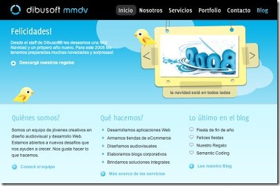
dibusoft

Dibusoft.com combines visual appeal with clear site structure. The site has 9 main navigation options which are visible at the first glance. The choice of colors might be too light, though.

Letting the user see clearly what functions are available is a fundamental principle of successful user interface design. It doesn’t really matter how this is achieved. What matters is that the content is well-understood and visitors feel comfortable with the way they interact with the system.

5. Make use of effective writing

As the Web is different from print, it’s necessary to adjust the writing style to users’ preferences and browsing habits. Promotional writing won’t be read. Long text blocks without images and keywords marked in bold or italics will be skipped. Exaggerated language will be ignored.

Talk business. Avoid cute or clever names, marketing-induced names, company-specific names, and unfamiliar technical names. For instance, if you describe a service and want users to create an account, “sign up” is better than “start now!” which is again better than “explore our services”.
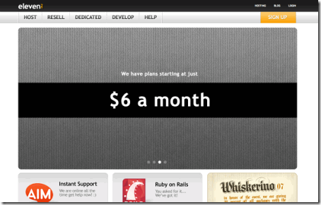
eleven2

Eleven2.com gets directly to the point. No cute words, no exaggerated statements. Instead a price: just what visitors are looking for.

An optimal solution for effective writing is to

  • use short and concise phrases (come to the point as quickly as possible),
  • use scannable layout (categorize the content, use multiple heading levels, use visual elements and bulleted lists which break the flow of uniform text blocks),
  • use plain and objective language (a promotion doesn’t need to sound like advertisement; give your users some reasonable and objective reason why they should use your service or stay on your web-site)
6. Strive for simplicity

The “keep it simple”-principle (KIS) should be the primary goal of site design. Users are rarely on a site to enjoy the design; furthermore, in most cases they are looking for the information despite the design. Strive for simplicity instead of complexity.

crc

Crcbus provides visitors with a clean and simple design. You may have no idea what the site is about as it is in Italian, however you can directly recognize the navigation, header, content area and the footer. Notice how even icons manage to communicate the information clearly. Once the icons are hovered, additional information is provided.

From the visitors’ point of view, the best site design is a pure text, without any advertisements or further content blocks matching exactly the query visitors used or the content they’ve been looking for. This is one of the reasons why a user-friendly print-version of web pages is essential for good user experience.

simple

Finch clearly presents the information about the site and gives visitors a choice of options without overcrowding them with unnecessary content.

7. Don’t be afraid of the white space

Actually it’s really hard to overestimate the importance of white space. Not only does it help to reduce the cognitive load for the visitors, but it makes it possible to perceive the information presented on the screen. When a new visitor approaches a design layout, the first thing he/she tries to do is to scan the page and divide the content area into digestible pieces of information.

Complex structures are harder to read, scan, analyze and work with. If you have the choice between separating two design segments by a visible line or by some whitespace, it’s usually better to use the whitespace solution.Hierarchical structures reduce complexity (Simon’s Law): the better you manage to provide users with a sense of visual hierarchy, the easier your content will be to perceive.

cameron

White space is good. Cameron.io uses white space as a primary design element. The result is a well-scannable layout which gives the content a dominating position it deserves.

8. Communicate effectively with a “visible language”

In his papers on effective visual communication, Aaron Marcus states three fundamental principles involved in the use of the so-called “visible language” — the content users see on a screen.

  • Organize: provide the user with a clear and consistent conceptual structure. Consistency, screen layout, relationships and navigability are important concepts of organization. The same conventions and rules should be applied to all elements.
  • Economize: do the most with the least amount of cues and visual elements. Four major points to be considered: simplicity, clarity, distinctiveness, and emphasis. Simplicity includes only the elements that are most important for communication. Clarity: all components should be designed so their meaning is not ambiguous. Distinctiveness: the important properties of the necessary elements should be distinguishable. Emphasis: the most important elements should be easily perceived.
  • Communicate: match the presentation to the capabilities of the user. The user interface must keep in balance legibility, readability, typography, symbolism, multiple views, and color or texture in order to communicate successfully. Use max. 3 typefaces in a maximum of 3 point sizes — a maximum of 18 words or 50-80 characters per line of text.
9. Conventions are our friends

Conventional design of site elements doesn’t result in a boring web site. In fact, conventions are very useful as they reduce the learning curve, the need to figure out how things work. For instance, it would be a usability nightmare if all web-sites had different visual presentation of RSS-feeds. That’s not that different from our regular life where we tend to get used to basic principles of how we organize data (folders) or do shopping (placement of products).

With conventions you can gain users’ confidence, trust, reliability and prove your credibility. Follow users’ expectations — understand what they’re expecting from a site navigation, text structure, search placement etc. (see Nielsen’s Usability Alertbox for more information)
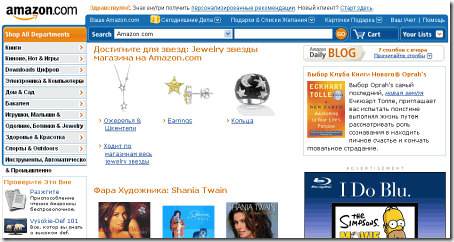
babelfish  
BabelFish in use: Amazon.com in Russian.

A typical example from usability sessions is to translate the page in Japanese (assuming your web users don’t know Japanese, e.g. with Babelfish) and provide your usability testers with a task to find something in the page of different language. If conventions are well-applied, users will be able to achieve a not-too-specific objective, even if they can’t understand a word of it.

Steve Krug suggests that it’s better to innovate only when you know you really have a better idea, but take advantages of conventions when you don’t.

10. Test early, test often

This so-called TETO-principle should be applied to every web design project as usability tests often provide crucial insights into significant problems and issues related to a given layout.

Test not too late, not too little and not for the wrong reasons. In the latter case it’s necessary to understand that most design decisions are local; that means that you can’t universally answer whether some layout is better than the other one as you need to analyze it from a very specific point of view (considering requirements, stakeholders, budget etc.).

Some important points to keep in mind:

  • according to Steve Krug, testing one user is 100% better than testing none and testing one user early in the project is better than testing 50 near the end. Accoring to Boehm’s first law, errors are most frequent during requirements and design activities and are the more expensive the later they are removed.
  • testing is an iterative process. That means that you design something, test it, fix it and then test it again. There might be problems which haven’t been found during the first round as users were practically blocked by other problems.
  • usability tests always produce useful results. Either you’ll be pointed to the problems you have or you’ll be pointed to the absence of major design flaws which is in both cases a useful insight for your project.
  • according to Weinberg’s law, a developer is unsuited to test his or her code. This holds for designers as well. After you’ve worked on a site for few weeks, you can’t observe it from a fresh perspective anymore. You know how it is built and therefore you know exactly how it works — you have the wisdom independent testers and visitors of your site wouldn’t have.

Bottom line: if you want a great site, you’ve got to test.

Source : smashingmagazine

Tuesday, March 31, 2009

10 Inspiring Videos on Job Hunting

2009 economic condition is terrible. Many people suddenly jobless. But you shouldn’t surrender. May this 10 videos help you find a new job.

Richard Bolles Tips

How long does it take to find a new job? How effective are resumes? What is the #1 advice for the unemployed? Richard Bolles, author of the #1 best-selling career book of all time, answers these questions and offers advice to help anyone find any job.

Visit: http://www.jobhuntersbible.com for more tips on networking, resume, and how to find a job.
Or better yet, purchase your own copy of: "What Color is Your Parachute? A Practical Manual for Job-Hunters and Career-Changers


Maggie Mistal Tips

It's hard enough to find a job in good times--what are you supposed to do when jobs are scarce? Career coach Maggie Mistal has great advice for people trying to find a job during a recession.
Finding a job during a recession
Being without a job is never easy, but it can be extremely stressful during hard economic times. Here are some tips for finding a job during a recession.


TJ. WALKER TIPS

Are you looking for a job? Do you need help in doing your best in a job interview? Then listen to TJ Walkers tips for getting remembered in your job interview.


Denham Resources Tips

A woman, interviewing for a pharmaceutical sales position, answers the common interview question: Tell me about yourself. This is an example of a GOOD way to answer this question.
When describing yourself, you should give specific examples of your professional and personal qualities. Intertwine those examples with your character traits that make you who you are. Stay relevant to the job position and company culture.
Created by Fresno, California's most respected Recruiting, Staffing and Human Resources consulting firm -- Denham Resources.


Expert Village Tips

Learn the best way to answer job interview questions for a successful interview with expert interviewing tips in this free online career related video clip.

Ian Iacocca Tips

I want to share 2 important techniques/tips that I have used to get more successful job interviews.

  1. Connecting with people vs. Being serious and business-like (ie. Really really professional) at the job interview
  2. Resume Line-by-line technique for job interviews
    You've parked your car. You walk out of the car, fixing your attire in the little left hand mirror of the car. You make sure you have all your papers. Then you go into the building and up the escalator. You can feel the nervousness creep up on you, and you haven't even reached the office yet.

I hope you've gotten a lot of value out of these ideas. For more great tips, I suggest you go here:
http://impressyourinterviewers.com/blog


Monster.co.uk Tips


Monster.co.uk and skillstudio.co.uk show you how to answer some of the most common questions you will face at a job interview.


Smart Selling Tips


Here is a video that will discuss the most commonly asked interview questions. You will also learn the 5 Basic Principles of how to answer any individual Job Interview Question. The way you answer a job interview question is as important as the answer itself.

Frank Furness Tips


Know how to approach every job interview with confidence. Find out the tools and tactics needed to prepare you for the interview.

Bill Richardson Tough interview